Introduction
The news organization Mother Jones has an open-source database of US mass shootings from 1982 to 2019 available online. The data was gathered as part of an in-depth investigation on mass shootings after the movie-theater shooting in Aurora, Colorado in July, 2012, where 12 people were killed, and over 70 people injured. I’ve been wanting to learn how to animate data visualizations with the gganimate package. I thought that it would be a good idea to animate the mass shooting data. The goal of something like a GIF is to capture the attention viewers and hopefully encourage them to want to learn further about the subject.
The Data
I first loaded the dyplr package for data manipulation, and ggplot2, ggthemes, and extrafont and maps to create the initial map visualization. The gganimate package extends the ggplot2 grammar of graphics to create animations.
The available data contains 117 mass shooting cases with variables such as the case name, the date of the mass shooting, the number of fatalities, injuries, and total victims (fatalities and injuries combined), the race and gender of the shooter, and the type of shooting (mass or spree). For the animation I used latitude and longitude to map the points of the shooting location. The year variable was used to progressively reveal the shootings in the animation. Each point was sized by the total number of victims.
glimpse(Mass_Shootings)## Observations: 117
## Variables: 24
## $ case <chr> "Jersey City kosher market shoo…
## $ location <chr> "Jersey City, New Jersey", "Pen…
## $ date <chr> "12/10/2019", "12/6/2019", "8/3…
## $ summary <chr> "David N. Anderson, 47, and Fra…
## $ fatalities <dbl> 4, 3, 7, 9, 22, 3, 12, 5, 3, 5,…
## $ injured <dbl> 3, 8, 25, 27, 26, 12, 4, 6, 1, …
## $ total_victims <dbl> 7, 11, 32, 36, 48, 15, 16, 11, …
## $ location_1 <chr> "Other", "Military", "Other", "…
## $ age_of_shooter <chr> "-", "-", "36", "24", "21", "19…
## $ prior_signs_mental_health_issues <chr> "-", "-", "yes", "-", "-", "TBD…
## $ mental_health_details <chr> "-", "-", "\"One friend of the …
## $ weapons_obtained_legally <chr> "-", "-", "-", "Yes", "Yes", "Y…
## $ where_obtained <chr> "-", "-", "-", "-", "-", "Nevad…
## $ weapon_type <chr> "-", "semiautomatic handgun", "…
## $ weapon_details <chr> "-", "-", "-", "AR-15-style rif…
## $ race <chr> "Black", "-", "White", "White",…
## $ gender <chr> "-", "M", "M", "M", "M", "M", "…
## $ sources <chr> "https://www.nytimes.com/2019/1…
## $ mental_health_sources <chr> "-", "-", "https://www.nytimes.…
## $ sources_additional_age <chr> "-", "-", "-", "-", "-", "-", "…
## $ latitude <dbl> 40.70736, 30.36471, 31.92597, 3…
## $ longitude <dbl> -74.08361, -87.28857, -102.2796…
## $ type <chr> "Spree", "Mass", "Spree", "Mass…
## $ year <dbl> 2019, 2019, 2019, 2019, 2019, 2…For the GIF I wanted to focus on mainland US, so I filtered out the ‘Xerox Killings’ case of 1999 in Honolulu, Hawaii. I also created an id variable to partition the data when preparing the data visualization
MS_Main <- Mass_Shootings %>% filter(location != "Honolulu, Hawaii") %>% arrange(date)MS_Main <- MS_Main %>% mutate(id = row_number())I used the maps package to display a map of the United States, and filtered the loaded map to exclude the state of Hawaii.
MainStates <- map_data("state")The Map
Before creating the map I loaded extra availables fonts to customize the data visualization texts, and created a set of breaks for the total victims legend.
font_import()## Importing fonts may take a few minutes, depending on the number of fonts and the speed of the system.
## Continue? [y/n]loadfonts()mybreaks <- c(10, 25, 50, 100, 600)I wrote the code below to make the initial map to be animated:
map <- ggplot() +
  # Code for the map
  geom_polygon(data = MainStates, aes(x=long, y = lat, group = group), color = "grey37", fill = "grey12",   alpha = .9) +
  coord_fixed(1.3) +
  # For the pounts
  geom_point(data=MS_Main, aes(x=longitude, y=latitude, group = id, size = total_victims, shape = 21,fill = "firebrick3", color = "firebrick3"), alpha = 0.8) +
  # The theme_void() function removes the x and y axis to just show the map
  theme_void() +
  scale_shape_identity() +
  # Set the breaks for the total victims size of the points
  scale_x_continuous(breaks = mybreaks) +
  # Remove the color and fill legends
  guides(color = FALSE, fill= FALSE) +
  # Determine the size of the points
  scale_size(range = c(1, 9),breaks = mybreaks) +
  # Add the title subtitle, caption, and legend title
  ggtitle("US Mass Shootings 1982-2019") +
  labs(subtitle = 'Year: {frame_along}',
       caption = "* Total victims includes fatalities and injuries\nSource: Mother Jones",
       size = "Total Victims*") +
  # The override.aes() function overides the default color of the legend points to the desired color
  guides(size=guide_legend(override.aes=list(color= "firebrick3"))) +
  # Add font
  theme(
        # Move the legend towards the bottom
        legend.position = "bottom",
        # Place horizontal legend
        legend.direction = "horizontal",
        # Customize text to Garamond and adjust the size and position of the title subtitle and caption
        legend.text = element_text(family = "Garamond"),
        legend.title = element_text(family = "Garamond"),
        plot.title = element_text(family = "Garamond", size = 16, hjust = 0.5),
        plot.subtitle = element_text(family = "Garamond", hjust = .95),
        plot.caption = element_text(family = "Garamond", hjust = 0.1),
        # Set plot margins
        plot.margin = margin(1,1,1,1, "cm"))
I set the map color to a dark gray with ligter gray for the state outlines. I wanted a strong contrast between the map and the points to emphasize the gravitiy of the shootings. The subtitle of ‘year: {frame_along}’ indicates the year transition of each frame created in the animation. I adjusted the subtitle to the right since I wanted the emphasis to be on the map.
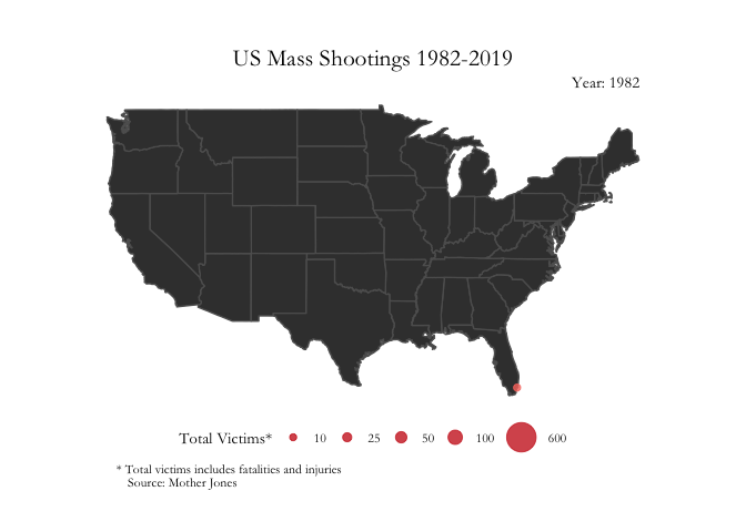
map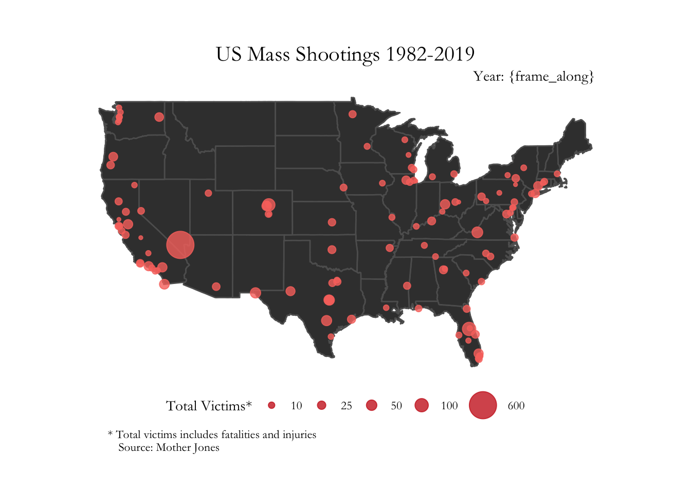
The Animation
Creating the animation is as simple as adding the transition_reveal() function. This function defines how the data is revealed.
anim_map <- map + transition_reveal(as.integer(year)) + enter_fade()I set the global options to display sharp resolution for the animation output.
To render the plot I use the animate() function and set the end_pause argument to 30 frames before the rendered animation is repeated.
options(gganimate.dev_args = list(width = 5, height = 7, res = 320))animate(anim_map, end_pause = 30)